
Searching:
0 results found Back
BackCharts/CreateChart
Description
To retrieve data from Axonize to be rendered in a chart.
See the following for request and response details:
See Also
Request ‒ Charts/CreateChart
| Property | Type | Description | Mandatory |
| startDate/ endDate | DateTime | Specifies an absolute range of dates to get data for the Chart. If you leave this field empty, then you must specify the startDate/endDate for each series.
Both of these fields must be used together, meaning that you cannot just specify one or the other. To set a relative date range, use the period (see below) property instead. |
|
| period | String/ Enum |
Specifies a relative time period to retrieve data. Use one of the values below:
For example, FiveDays returns the data from the last five days. |
|
| interval | String/Enum | Specifies the interval at which retrieved data is aggregated.
Use one of the values below:
For example, Hours returns the data aggregated per hour. |
|
| timezone | String | The timezone in which to make the aggregation call.
Timezones are relevant for aggregation because the same data will be aggregated differently, based on which timezone is used. If you aggregate per day, the same data point can be in different days based on which timezone is used. For a list of timezones, see – https://en.wikipedia.org/wiki/List_of_tz_database_time_zones Example: “timezone”:”Asia/Jerusalem” |
|
| series | Array | series defines how Axonize will return a series of data points in the response. Each such series is defined in the series property, as described below.
Each series can have different inputs (Device, for example), different aggregation and a different time range. For example, one series can be the average temperature per month from a temperature sensor and a second series could be the energy consumption of an HVAC system. The definitions in a Chart (such as, startDate/endDate [described above]) override the definition of a series. Therefore, if you would like to specify a different value for the startDate/endDate of each series, then define them for each Series (described below) and do not define them for the Chart (in the fields described above). |
Y |
| series/id | String | Specify any unique identifier for each series.
Note ‒ This ID is different than the other IDs in Axonize because this ID is defined by you and is not automatically assigned by Axonize. The response to the CreateChart endpoint will contain data for each series. This identifier enables you to recognize the data returned in the response for this series. The series that are returned in the response do not appear in the same order as defined in the request. However, they can be identified by finding this ID in the response. |
|
| series/name | String | Specifies the name of the series property. For example, to be used in displaying chart name in a legend. | |
| series/aggregation | String/Enum | Specifies the method used to aggregate data in a series. Use one of the values below:
|
Y |
| series/inputID | String | These properties enable you to specify another level of aggregation of the response data, such as the Device level or Product level or Application level.
In inputType, specify the entity ID type. Use one of the following values –
In inputID, specify the actual ID value. |
Y |
| series/inputType | String/Enum | Y | |
| series/eventType | String | The event type – (See Defining a Device Event Manifest.) Axonize provides a list of the event types for your selection, such as 7 for temperature, 8 for humidity, 9 for acceleration, 1001 for pressure and so on. | Y |
| series/eventName | String | This property is optional. There may be more than one series of each eventType (described above), the eventName property helps uniquely identify each series calculation of a specific eventType that is returned in the response. If no eventName is given, all the events of the same type are aggregated together.
For example, if an HVAC has both the target temperature and the actual temperature, you may want to use only an actual temperature. On the other hand, if you are looking at a refrigeration room that has three different temperature readings from different parts of the room, you may want them all averaged together. |
|
| series/startDate/endDate | String | Specifies the range of dates of the queried data in this series. If no date is entered here, then the startDate/endDate defined for the Chart (described above) is used. | |
| series/interval | String/Enum | Specifies the interval at which retrieved data is aggregated. This chart series has the same intervals as the chart level, but is for a specific series. | |
| series/period | String/Enum | Specifies a relative time period to retrieve data. This chart series has the same periods as the chart level, but is for a specific series. | |
| series/timezone | String | The timezone in which to make the aggregation call. This chart series has the same timezones as the chart level, but is for a specific series. | |
| machineLearningMethod | String/Enum | Specifies the machine learning method. Use one of the values below:
|
|
| methodAggregations | For internal use only. | ||
| pipelineAggregation | ChartAggregation | Specifies second aggregation on the Aggregation field | |
| gapPolicy | AggregationGapPolicy | Internal use | |
| timeFrame | Enum | Specify the chart aggregation time range
|
|
| cultureInfo | String | Specify the culture | |
| timeFilterStart | TimeSpan | Specify the start time of day of the data if needed | |
| timeFilterEnd | TimeSpan | Specify the end time of day of the data if needed | |
| CustomCron | String | Specify custom cron expression for when custom readings should be generated | |
| CustomTimeFrame | String | Specify custom time frame |
Example JSON Charts/CreateChart Request
curl -X POST \
https://api.stg.axonize.com/api/charts/createChart \
-H ‘Authorization: Token’ \
-H ‘Content-Type: application/json’ \
-H ‘appId: 801A048A-9F23-429F-BF0D-B6D35B22771E’ \
-d ‘{“interval”:”days”,”series”:[{“eventName”:”Humidity”,”eventType”:8,”aggregation”:”average”,”inputType”:0,”inputId”:”5b3c8ed719ec0c1cfc4107bf”,”startDate”:”2018-05-05T21:00:00.000Z”,”endDate”:”2018-07-25T20:59:59.000Z”,”id”:16,”machineLearningMethod”:null}],”timezone”:”Asia/Jerusalem”}”
Response ‒ Charts/CreateChart
The response that is returned contains the following properties, which may be nested.
| Property | Type | Description |
| title | String | The Device name from the first series (described below). |
| series | Array | Provides a list of series objects, each of which contains various properties (described below). Each series provides the data points to be displayed and information about displaying them.
For example – The quantity of series returned in the response may be larger than the quantity of series requested. This depends on the data type of the events that are being queried. For example, if a count of a non‑numeric data type is being queried (such as engine status – on, off, flooded), then the quantity of each engine status (reading) is provided as a data point (meaning three series are returned – one for each status). Note ‒ This is not the same series object as in the createChart response. |
| series/id | Integer | The unique identifier for each series. You may refer to the request (described above) for a more detailed explanation. |
| series/data | Double Dimension Array | Each series contains various data points.
Each data point specifies the value on the X and Y axes. Data points are an array –
For example –
|
| series/name | String | Not in use. |
| series/categories | List of Strings | This is a response-only property. This property is only populated if Raw is selected in the series/aggregation property (described below) and the data is non-numeric (such as String type).
The series/categories property is not filled with the raw values, but instead uses the events/valueRange/allowedValues property in Products to convert it to show how this value appears in the Axonize Portal. For example, this identifier could be used to convert the value 0 so that it appears as Closed in the Axonize Portal and the value 1 as Open. The series/categories property requests that the values that are returned will be after conversion (meaning the display values of the allowed value range), such as Closed and Open instead of 0 and 1. |
| series/machineLearningResults | Object | When setting a machine learning algorithm in the machineLearningMethod property of the request for a series, then this property in the response indicates the part of the series for which data was calculated. This means that it indicates which part of the data is the result of the machine learning. |
| series/machineLearningResults/anomalyIndices | Array of Integers | Each element in this array is an index point that points to the data array and indicates that the data point was detected as an anomaly.
For example, if the data array looks like that below – “: [ [ 1530748800000, 1.40 ], [ 1530835200000, 3.97 ], [ 1530921600000, 66666665 ], [ 1531008000000, 55552.42 ], [ 1531094400000, 5.08 ], [ 1531180800000, 4.77 } ] . . . . . Then, the anomalyIndices looks as follows – [2,3] The anomalyIndices result above indicates two anomalies. The algorithm starts counting from the top from 0. The third data point in the example above is one of the two anomalies, because it is very long (66666665). 2 represents the sequential number of the anomaly, counting from the top. The fourth data point in the example above is the second anomaly (3). Therefore, for this example, the anomalyIndices property result is [2,3]. |
| series/machineLearningResults/forcastRanges | Array of Range Objects | If you select either LinearForecast or QuadraticForecast) then the forecast range specifies the index range for all data points that are forecasted by the algorithm, but are not real data points.
A Range has two properties – Min and Max, which specify the start of the range and the end of the range. Because this is not necessarily linear (for example, when forecasting missing data points), then each consecutive forecast point will be declared by its own range. Currently, Axonize only returns a single range and only supports future forecasting. For example, if the actual data sent by the device is [2,3,4,5,6] and you requested a forecast, then the chart response data might look as follows – [ 1530748800000, 2 ], [ 1530835200000, 3 ], [ 1530921600000, 4 ], [ 1531008000000, 5 ], [ 1531094400000, 6 ], [ 1531180800000, 7 ], [ 1531267200000, 8 ], [ 1531353600000, 9 ] In this case, the forecast ranges look as follows – [{ “min”:5,”max”:7}] For this example, the device actually sent [2,3,4,5,6] and the algorithm calculated [7,8,9]. In this case, [7,8,9] indicates what the future values would look like based on the current trend/pattern. These are calculated values only and were not sent by the device. The result shows you the range, but not every data point. For this example, the range of calculated data points (when counting starting from 0 at the top) begins at index 5 and ends at index 7. |
| series/tooltip | Not in use. | |
| subtitle | String | Not in use. |
| xAxis | Provides information that may suggest how to display the component appearing in the chart. The following properties are provided for xAxis. | |
| xAxis/type | String | The type of the X axis. Currently, the only option (value) is dataTime. |
| xAxis/title/text | String | The title of the X axis. |
| xAxis/plotLines | Provides a variety of properties that describe the graphic representation of a plotline on a chart, such as the value, color, dash style, width (of line) and label.
A plotline is typically a dashed line drawn parallel with the axis on a chart. A plotline typically shows a minimum or a maximum threshold. |
|
| xAxis/plotLines | Not in use. | |
| yAxis | Has the same description and properties as X Axis, except it is for the Y Axis. |
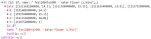
Example JSON Charts/CreateChart Response
Status 200 – Created
{
“title”: {
“text”: “Farm”
},
“subtitle”: null,
“yAxis”: {
“type”: null,
“title”: null,
“plotLines”: [],
“categories”: null
},
“xAxis”: {
“type”: “datetime”,
“title”: {
“text”: “Date”
},
“plotLines”: null,
“categories”: null
},
“series”: [
{
“id”: 16,
“name”: “Farm- Humidity”,
“data”: [
[
1530748800000,
1.4032261717052736e+37
],
[
1530835200000,
3.972159949481541e+37
],
[
1530921600000,
5.2294780489847939e+37
],
[
1531008000000,
2.4209969427088574e+37
],
[
1531094400000,
5.0841868764666156e+37
],
[
1531180800000,
2.5504528576382167e+37
],
[
1531267200000,
3.1448612283140933e+37
],
[
1531353600000,
4.2535293329816107e+37
],
[
1531440000000,
3.9822585669637886e+37
],
[
1531526400000,
2.8301478565153434e+37
],
[
1531612800000,
5.3833515793385854e+37
],
[
1531699200000,
7.08365563943675e+37
],
[
1531785600000,
5.7919959256392239e+37
],
[
1531872000000,
5.6602957130306867e+37
],
[
1531958400000,
7.078138824024557e+37
],
[
1532044800000,
2.8356862219877405e+37
],
[
1532131200000,
2.4305697187950316e+37
],
[
1532217600000,
1.3889075373001177e+37
],
[
1532304000000,
1.4178215609336664e+37
],
[
1532390400000,
1.3889075373001177e+37
],
[
1532476800000,
16.3
]
],
“machineLearningResults”: {
“anomalyIndicies”: [],
“forcastRanges”: null
},
“tooltip”: null
}
]
}