
Searching:
0 results found Back
BackViewing Device and Group Details
In the Axonize Portal, the Devices view enables you to manage the Devices in the system.
In the Devices view, you can choose to view either the Device list or the Device Group list by selecting the relevant option at the top right of the window.
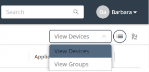
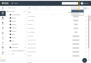
When you select View Devices, each row in the device list represents a different Device.
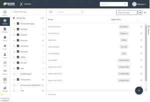
When you select View Groups, each row represents a different Group of Devices. The Group to which a Device belongs is defined when the Device is created.
To view Device details –
- In the left pane, click the
 button to display the Device list.
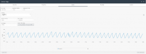
 - In the Device list, double-click anywhere in a Device row to view that Device’s details. The following window displays, showing the details for the selected Device.
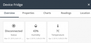
This window provides the following tabs – Overview, Properties, Charts, Readings and Location.
Overview Tab
The Overview tab (shown above) displays the name of the last reading, and its value, timestamp and icon (as defined in the Product).
Properties Tab
The Properties tab displays the following information for the Device –
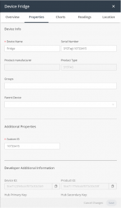
- Device Activation – Toggles to activate/deactivate the Device. This slider is only relevant for a Virtual Device.
- Device Name – The name of the Device.
- Serial Number – The serial number assigned to the Device by the customer.
- Product Manufacturer – The name of the manufacturer of the Product to which the Device belongs.
- Product Type – The Product type assigned to the Device. All Devices with a given Product type have the same properties.
- Groups – The name of the group(s) to which the Device belongs.
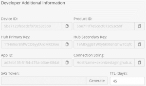
- Developer Additional Information – Displays additional developer details for the Device. Information only displays in this area if Developer mode is enabled on the Product. To enable Developer mode, see xxx.
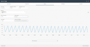
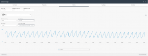
Charts Tab
The Charts tab enables you to visualize the data collected by Axonize for the Device. You can display multiple readings in the same Chart, in order to better understand the relationship between the data series. For example, how humidity affects temperature or how power consumption affects a device’s temperature.
You can create a Chart whenever you want to graphically present Device data and/or for further analysis.
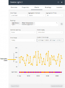
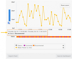
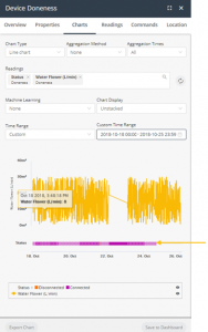
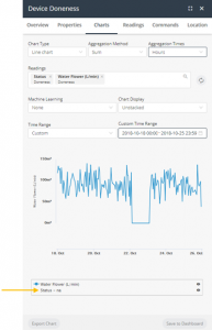
A Chart presents telemetric readings data in a graph, as shown above. Telemetric data includes data whose logical type is None, Range or Allowed Values (State), as defined for the Product (see xxx). For example, temperature readings.
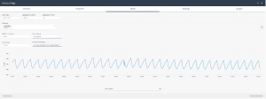
In addition, a Chart presents state data as a color‑coded bar(s) beneath the chart. Chart data includes data whose logical type is Allowed Values, as defined for the Product (see xxx). For example, a Device that is Connected or Disconnected.
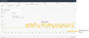
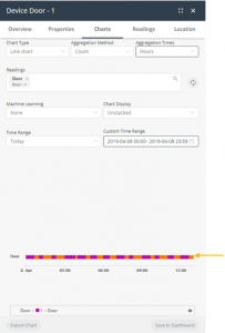
Charts that include an instantaneous event show the data for that event below the graph. Instantaneous events do not have values. Each time that the instantaneous event occurred is represented by a colored diamond. For example, the chart below shows two instantaneous events – Help and Help2.
Legend
A color-coded legend displays at the bottom of the window. Each series in the Chart displays in a different color.
![]()
You can hover over a series in the legend to display only that series in the Chart.
In the legend, you can click the ![]() button in a series row to remove that series from the Chart.
button in a series row to remove that series from the Chart.
For state-related data (see xxx), each value in the color-coded bar for a reading is represented by a different color. The same scale applies for both telemetric data and the state data in the color-coded bar.
For example, the example below shows two types of state-related readings – one for Status and one for Tamper.
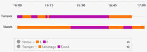
You can hover over a value in a color-coded bar to see more details about that value.
Charts can also be saved to a Dashboard.
To create a Chart, you specify the following information for it –
Note ‒ Currently, Chart definitions cannot be saved for reuse.
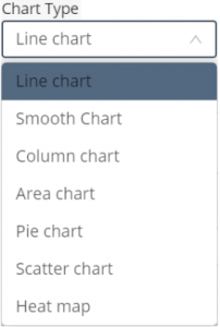
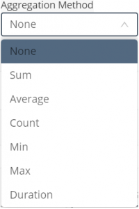
- Chart Type – Specifies the type of Chart to be created.
- Aggregation Method – Specifies the method used to aggregate data in a series.
- None means that no method is applied to the data, so that only raw data is returned.
- Duration means that data is aggregated based on how long the device was in a specific state. The data represents the total time that a device or product was in each state. Data is then aggregated based on each state.
Note that aggregation methods typically do not apply to state data, as described below –
-
-
- When the Aggregation Method is None, state data displays in a color-coded bar beneath the Chart instead of in the Chart itself (see xxx).
-
-
-
- When the Aggregation Method is Count, then state data displays in a color‑coded bar beneath the Chart. This is the only case where results using an aggregation method display in the color-coded bar, instead of the Chart.
-
-
-
- When the Aggregation Method is any value other than None or Count, such as Sum, Average and so on, then state data for the reading does not display in the color‑coded bar beneath the chart, and instead shows na next to its reading in the legend.
-
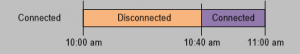
Let’s look at an example in more detail. Assume that you have an assembly that can either be Connected or Disconnected. When the Aggregation Method is Count, then there is no real relationship regarding how long a given state (Connected vs Disconnected) existed. The Count aggregation only counts the number of times each value was received during a given timeframe. In this case, there is no relationship to how long the state lasted.
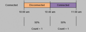
In contrast, when the Aggregation Method is None, then the amount of time that a given state existed is relevant. The following would show that the bar would show that it was Disconnected for two thirds of the time (meaning 40 minutes of the hour) and that it was Connected one third of the time (meaning 20 minutes of the hour).
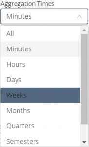
- Aggregation Times – Specifies the interval at which data is aggregated. For example, if the Aggregation Method is Sum and the Aggregation Times value is Hours, then the data in the Chart represents the sum of the values during that hour.
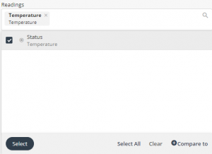
- Readings – Select the reading(s) to be included in the Chart. Each reading type in the Chart displays in a different color and series.
- Machine Learning – This feature is part of the Axonize Analytics Package, which enables you to forecast or predict the readings in the next time period based on algorithmic calculations. Different algorithms are used for the Forecast Linear and Forecast Quadratic options.
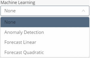
The Anomaly Detection option identifies single readings that deviate from the readings trend within the time period for the chart.
You can contact Axonize support for more for details about adding this feature to your system.
- Chart Display – Specifies the type of Chart to display. The following options are available –
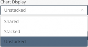
-
- Shared – Shows all readings with a single Y axis.
-
- Stacked – Shows all readings at one level, where each reading has its own Y axis and units.
-
- Unstacked – Shows all readings one on top of another. Each series does not necessarily use the same scale.
- Time Range – Specifies the day(s) and time range of the Chart.
![]()
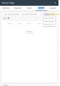
Readings Tab
The Readings tab shows the last readings from the Device. Readings are listed in chronological order, with the most recent reading at the top. You can set the time range to display, as well as export the readings using the Export button.
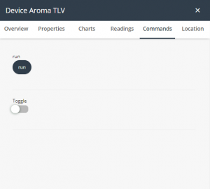
Commands Tab
Commands are created under the Product and are available under the Device à Command tab.
Location Tab
The Location tab displays the location of the Device on a map. The Location History/Current Location button below the map toggles to show either the location history or the current location of the device on the map, respectively.
Click the Current Location button to display the current location of the device on the map, as shown below. This is the default.
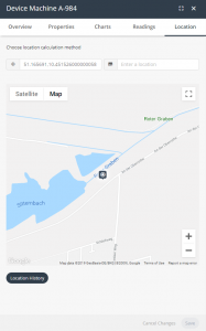
Note ‒ When the Location History button is showing below the map, the map shows the current location.
Click the Location History button to display the location history of the device on the map. Each device icon on the map represents the current or a previous location of the device on the map.
The Distance slider indicates the minimum distance of the displayed device icons on the map. The smaller the distance, the more device icons that display on the map, and vice versa.
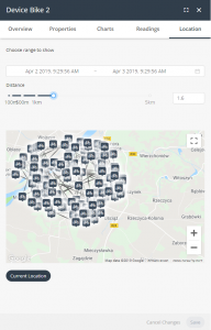
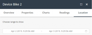
Use the Choose range to show fields to specify the range of time to show on the map.
To relocate a device, double-click a location on the map to relocate the device to that location. Then, click the Save button to save the setting.
You can edit a location by double-clicking it in the map.
Use the zoom buttons ![]() to increase or decrease the size of the map.
to increase or decrease the size of the map.